I created a series of conceptual advertisements that reimagined real products and brands within unexpected environments and narratives. Rather than presenting the products in conventional commercial settings, the goal was to place them in visually surprising contexts that challenged expectations and encouraged viewers to engage with the advertisements in a more imaginative way. Through composition, visual storytelling, and experimental design choices, I explored how branding can shift meaning depending on its environment while still maintaining a clear and recognizable identity.
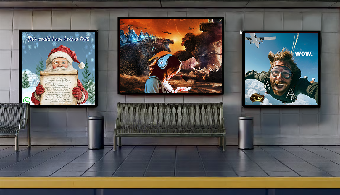
Mockup
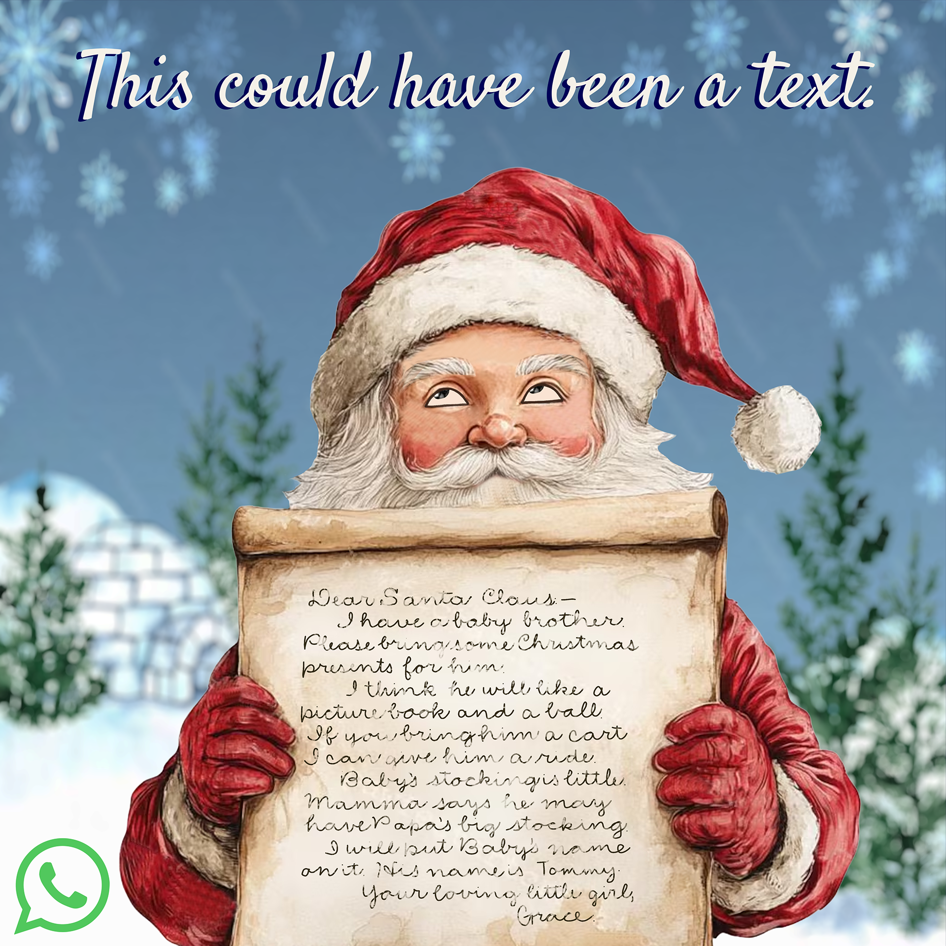
For this advertisement, I began with the tagline “This could have been a text” and built the entire concept around that single idea. I wanted the ad to humorously exaggerate the effort and length of communication before modern messaging, which led me to the visual idea of an oversized handwritten letter on scroll-like paper. From there, I considered who would naturally interact with long handwritten letters and landed on Santa Claus as the central figure, referencing the endless letters he receives from children each year. I sourced and combined separate images for Santa, the paper scroll, and the background to construct the final composition, then wrote the letter itself in childlike handwriting to reinforce the concept. To further the humor of the advertisement, I altered Santa’s expression from cheerful to visibly annoyed, with an eye roll that suggests exhaustion from reading such an unnecessarily long message. I paired the design with typography that felt playful and hand-drawn, almost as if Santa himself had written the advertisement. I chose WhatsApp specifically because of its global use and strong association with communication while traveling abroad, making it feel like the most fitting platform for the concept. The small green logo was intentionally used as a subtle accent against the dominant red tones of the composition, allowing the complementary red-and-green palette to reinforce the holiday atmosphere while keeping the branding recognizable but understated.
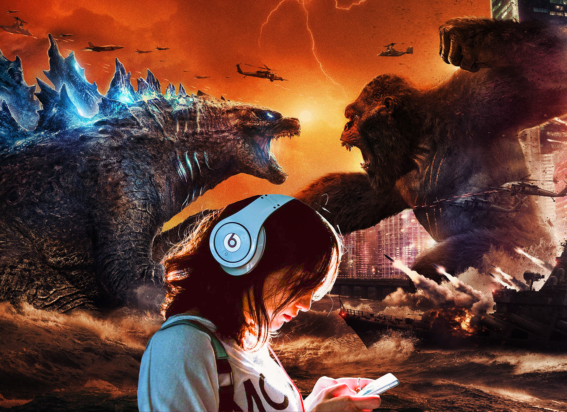
For this advertisement, I wanted to visually exaggerate the idea of noise cancellation by placing the main subject in the middle of complete chaos while remaining entirely disconnected from it. I built the concept around an intense fantasy-action environment filled with smoke, fire, destruction, and movement, ultimately choosing a fictional battle between King Kong and Godzilla to create spectacle without evoking real-world violence or disaster. The composition relies heavily on contrast, both visually and conceptually, juxtaposing the explosive action happening in the background with the calm, almost blissful stillness of the girl wearing the headphones. I wanted the advertisement to feel cinematic, overwhelming, and instantly attention-grabbing, while making the headphones themselves the undeniable focal point of the design. Since the product is so visually central, I intentionally designed the piece to function without a tagline, allowing the recognizable Beats by Dre logo on the headphones to communicate the entire concept on its own.
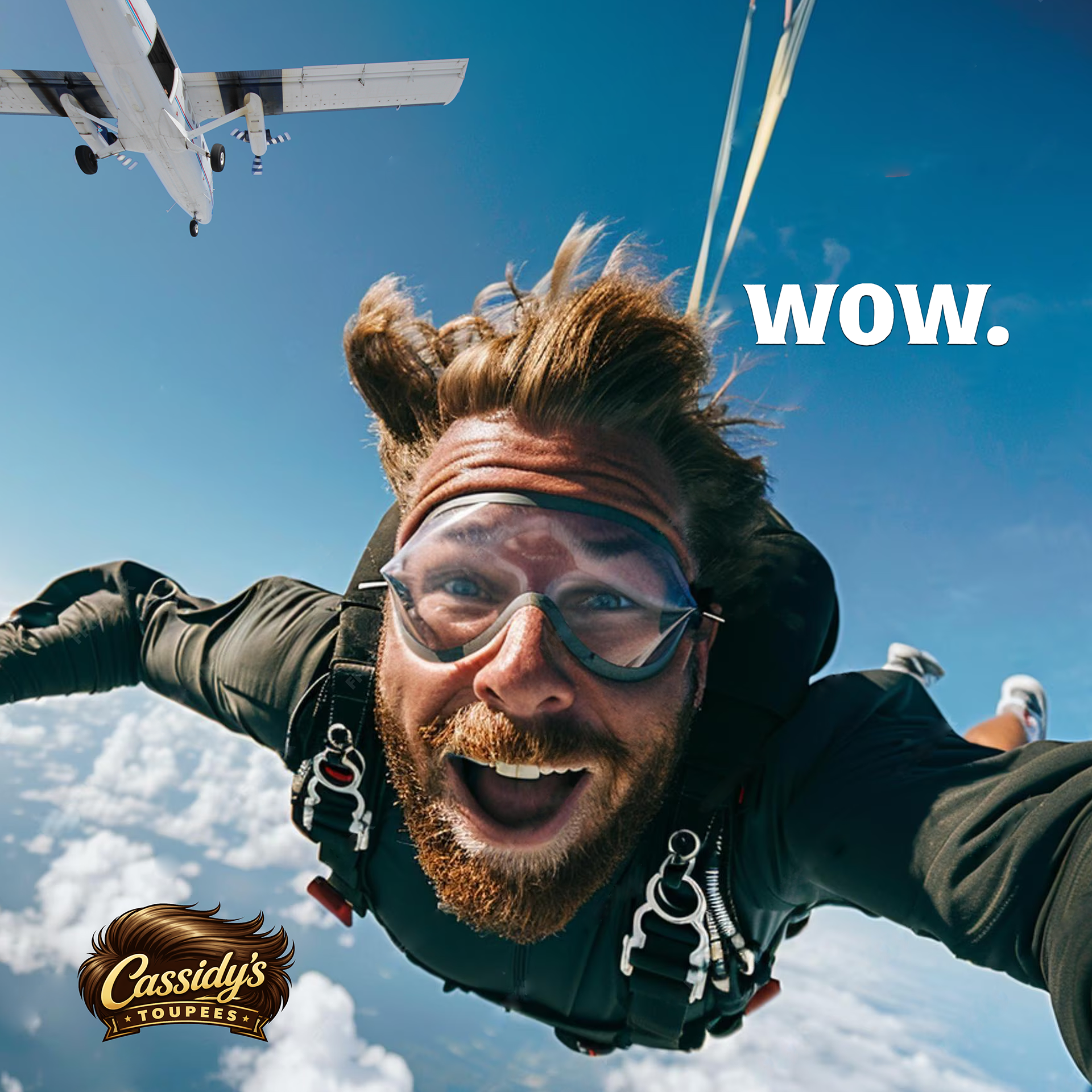
For this advertisement, I wanted to create something intentionally unexpected and humor-driven while keeping the overall visual execution relatively minimal. Since the assignment focused on placing brands in unconventional situations, I chose the idea of a toupee company because it already carries an inherent sense of surprise and comedy when approached in the right context. From there, I began thinking about the least expected environment for a toupee advertisement and landed on skydiving; a situation where maintaining perfect hair would seem almost impossible.
The humor of the ad relies on delayed realization. At first glance, the viewer sees a skydiver midair with the simple headline “wow,” but there is little indication of what is actually being advertised. Only after noticing the logo for Cassidy’s Toupees, which I designed myself, does the concept fully click into place. The joke comes from realizing that despite the intensity of skydiving, the hair looks completely natural and unmoved, making the toupee so seamless that it goes unnoticed at first. I constructed the composition by starting with an image of a skydiver, layering it with a background scene and adding an airplane for additional context and realism. The final design was intended to create a moment of pause followed by recognition, encouraging the viewer to reexamine the image and discover the humor embedded within the concept.