This project explored book sleeve and cover redesign through a combination of Adobe Photoshop and Illustrator, focusing on visual storytelling, branding, and conceptual reinterpretation. Rather than simply recreating existing covers, I approached each book as an opportunity to develop a completely new visual identity that reflected the themes, atmosphere, and emotional tone of the story in a more intentional way. Across each redesign, I experimented with typography, texture, color theory, illustration, and composition to create sleeves that felt cinematic, immersive, and distinct while still remaining connected to the narratives of the books themselves.

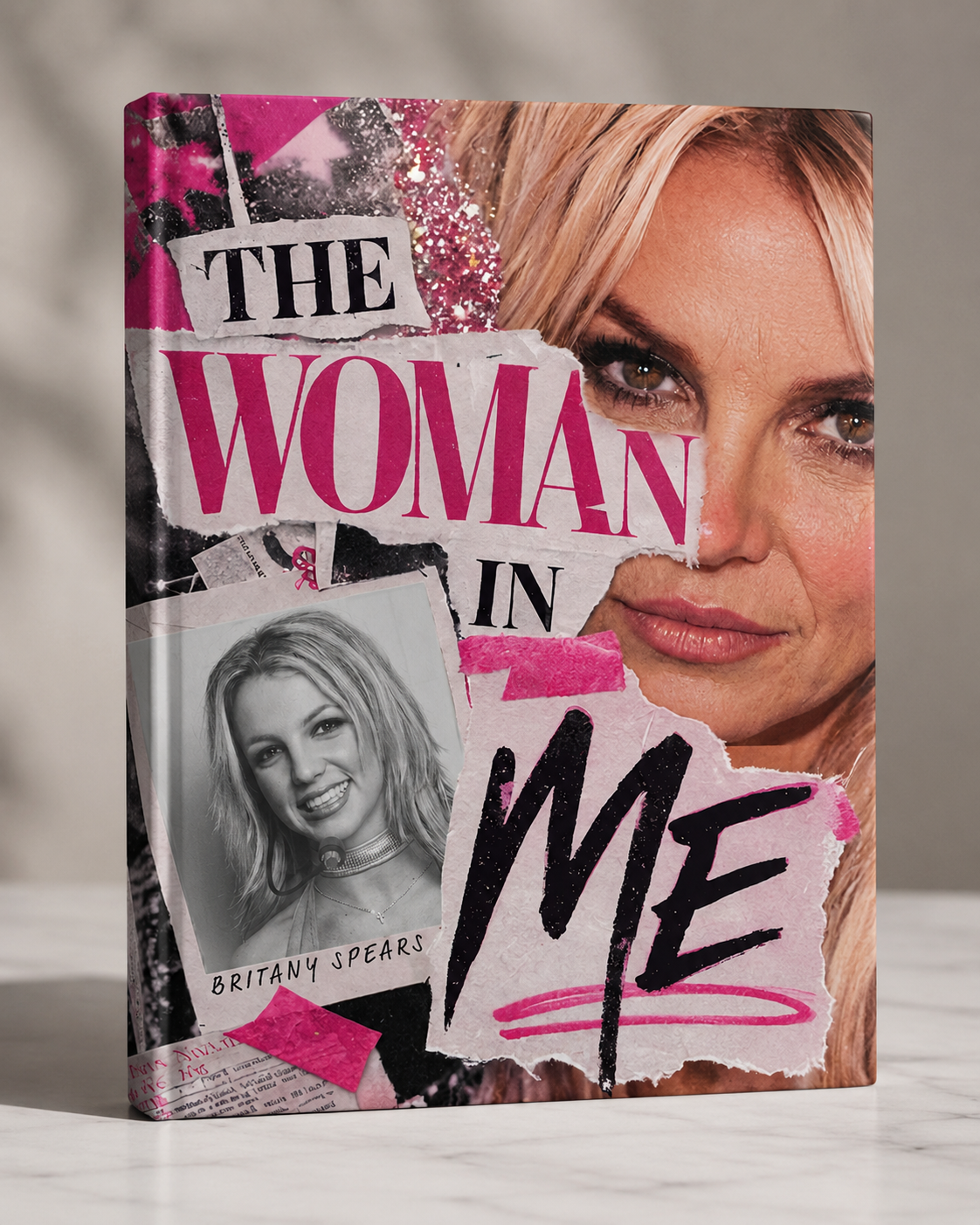
For The Woman in Me, I wanted to move away from the vulnerability-focused imagery often associated with the original cover and instead emphasize Britney Spears’ evolution from childhood fame into adulthood under constant public scrutiny. Inspired by the visual language of tabloids and celebrity magazines, I leaned into a bold editorial aesthetic that reflected both the intensity of pop culture and the invasive nature of fame. Through layered imagery, typography, and composition, the redesign explores identity, media perception, and personal growth within the spotlight of the entertainment industry.
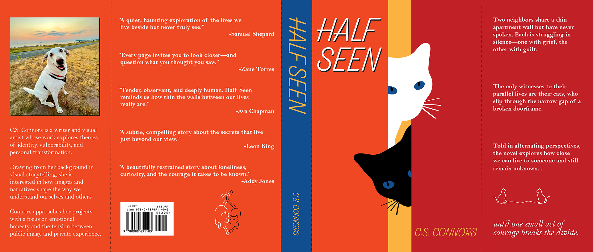
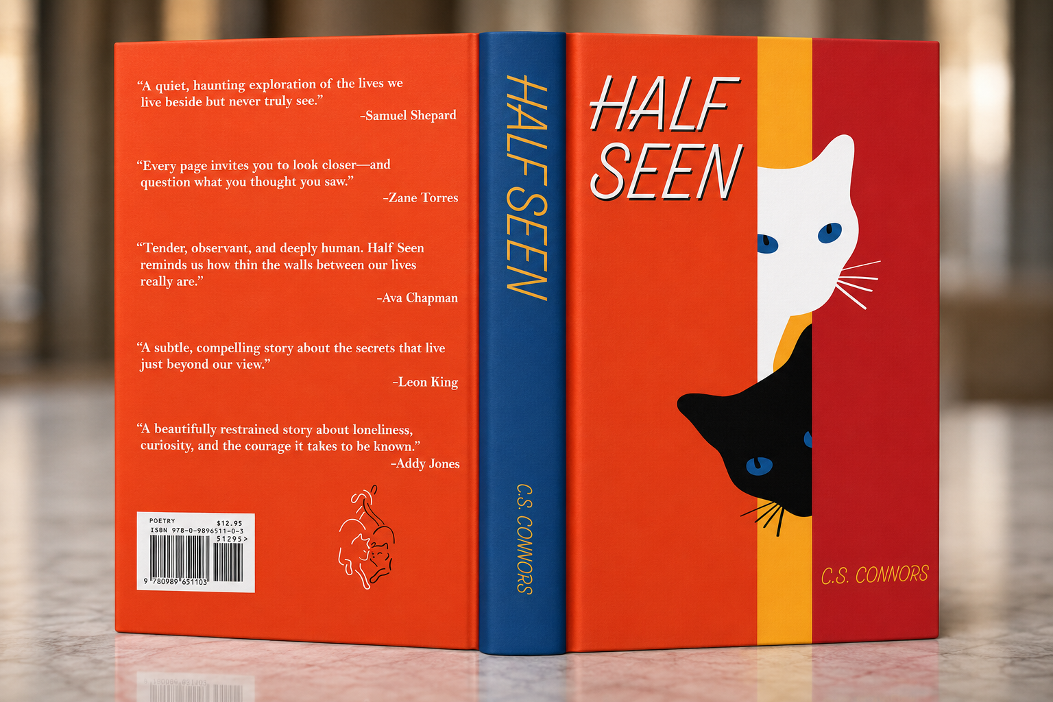
For my original book concept, Half Seen, I created a cover centered around the idea of adjacent lives; people existing close to one another while experiencing entirely different realities. I illustrated the cats featured on the cover myself and used warm, vibrant colors to create a sense of emotional contrast and quiet connection. The visual identity of the sleeve was designed to feel inviting and symbolic, using color and composition to hint at the layered relationships and perspectives explored within the imagined story.
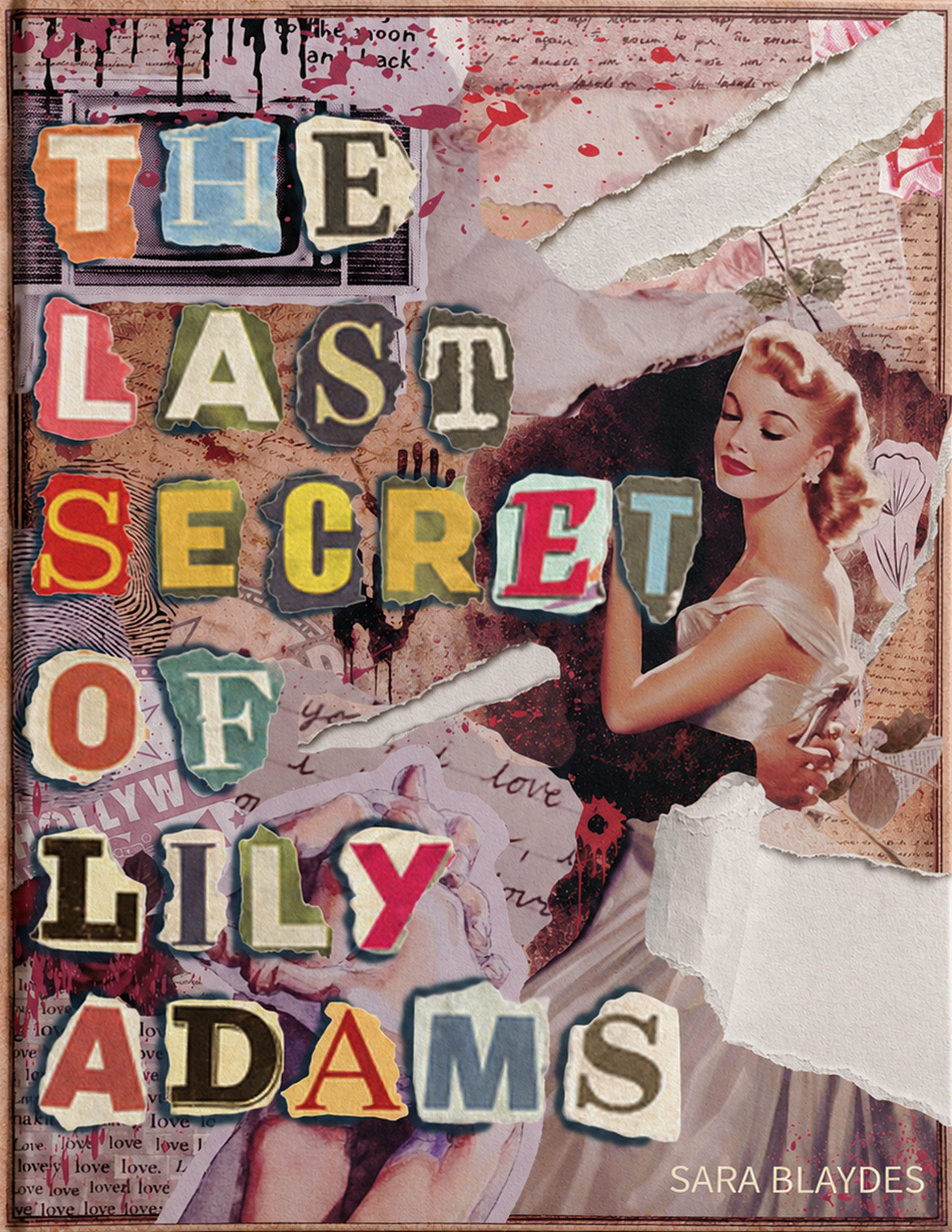
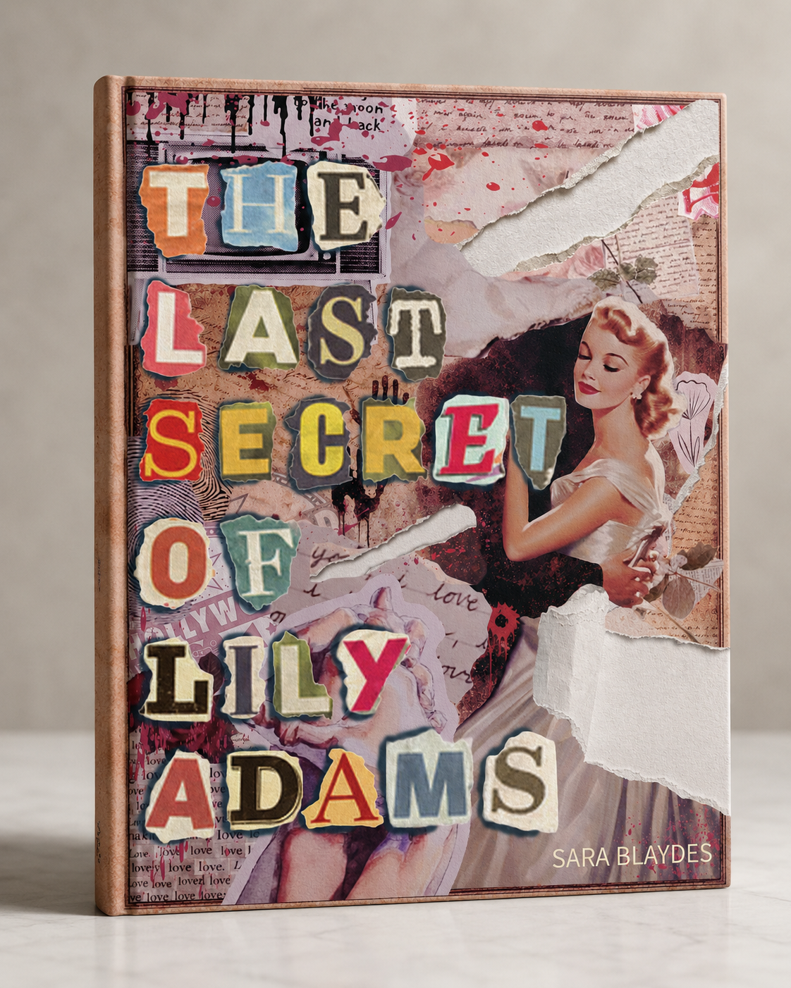
For The Last Secret of Lily Adams, I wanted the cover to feel cinematic, mysterious, and emotionally romantic. Drawing inspiration from the visual style of Hollywood’s Golden Age, I created a sleeve that balanced elegance with suspense through soft lighting, vintage-inspired typography, and layered textures. The overall aesthetic was designed to evoke the feeling of a ransom while still maintaining the intrigue and emotional tension associated with mystery and romance genres.
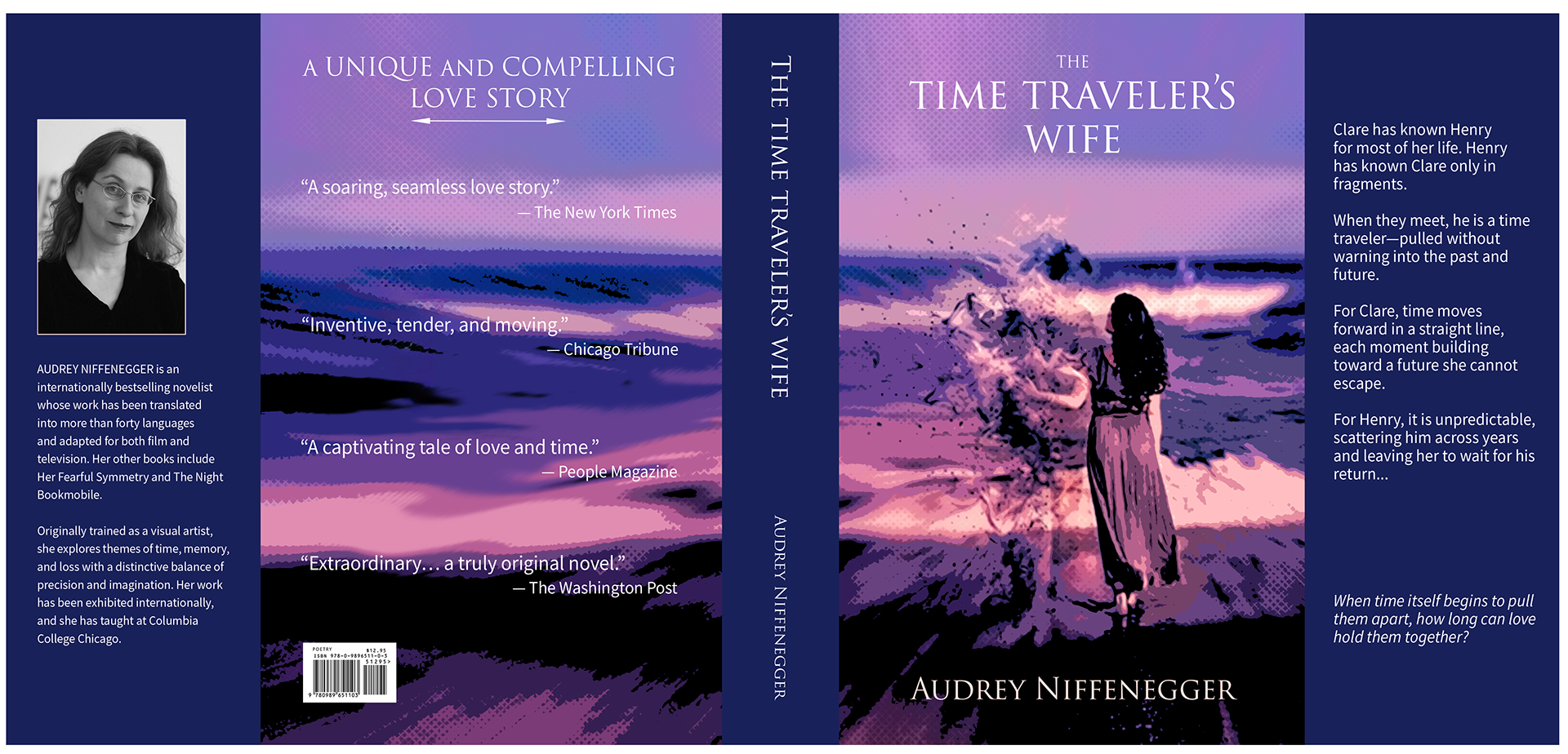
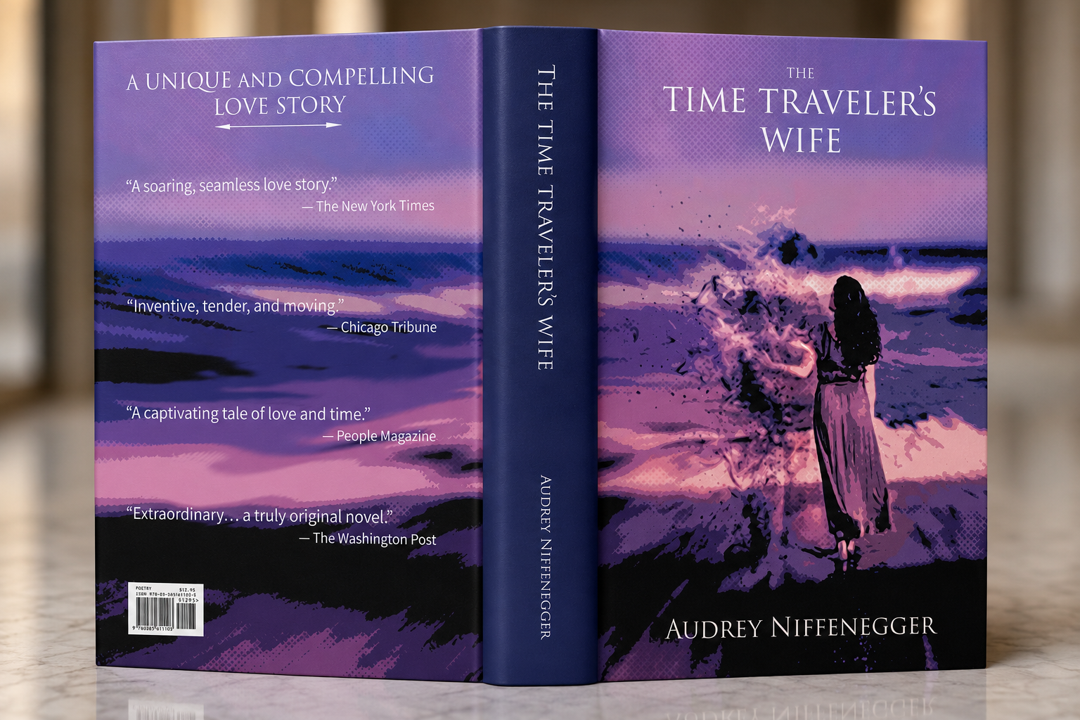
For The Time Traveler’s Wife, I centered the design around the emotional and fragmented nature of time within the story. Beginning with an image of the couple, I distorted and manipulated the photograph through color grading, texture overlays, and visual fragmentation to create a dreamlike sense of instability. Purple became the dominant color throughout the sleeve because it feels emotionally adjacent to red, the traditional color of love, while also carrying a more surreal and melancholic tone. To symbolize intersecting timelines and repeated encounters, I incorporated square and crosshatched patterns that visually overlap across the composition, echoing the structure of the narrative itself.