This assignment focused on developing a complete visual identity for a fictional musician, including a tour poster and a full album package with front and back cover designs. Using Photoshop, Illustrator, and InDesign, I built a cohesive branding system that extended across multiple formats while maintaining a consistent aesthetic and narrative. The project challenged me to think beyond a single composition and instead develop a unified visual world for an artist that does not exist, considering typography, imagery, layout, and mood across both print and promotional materials.
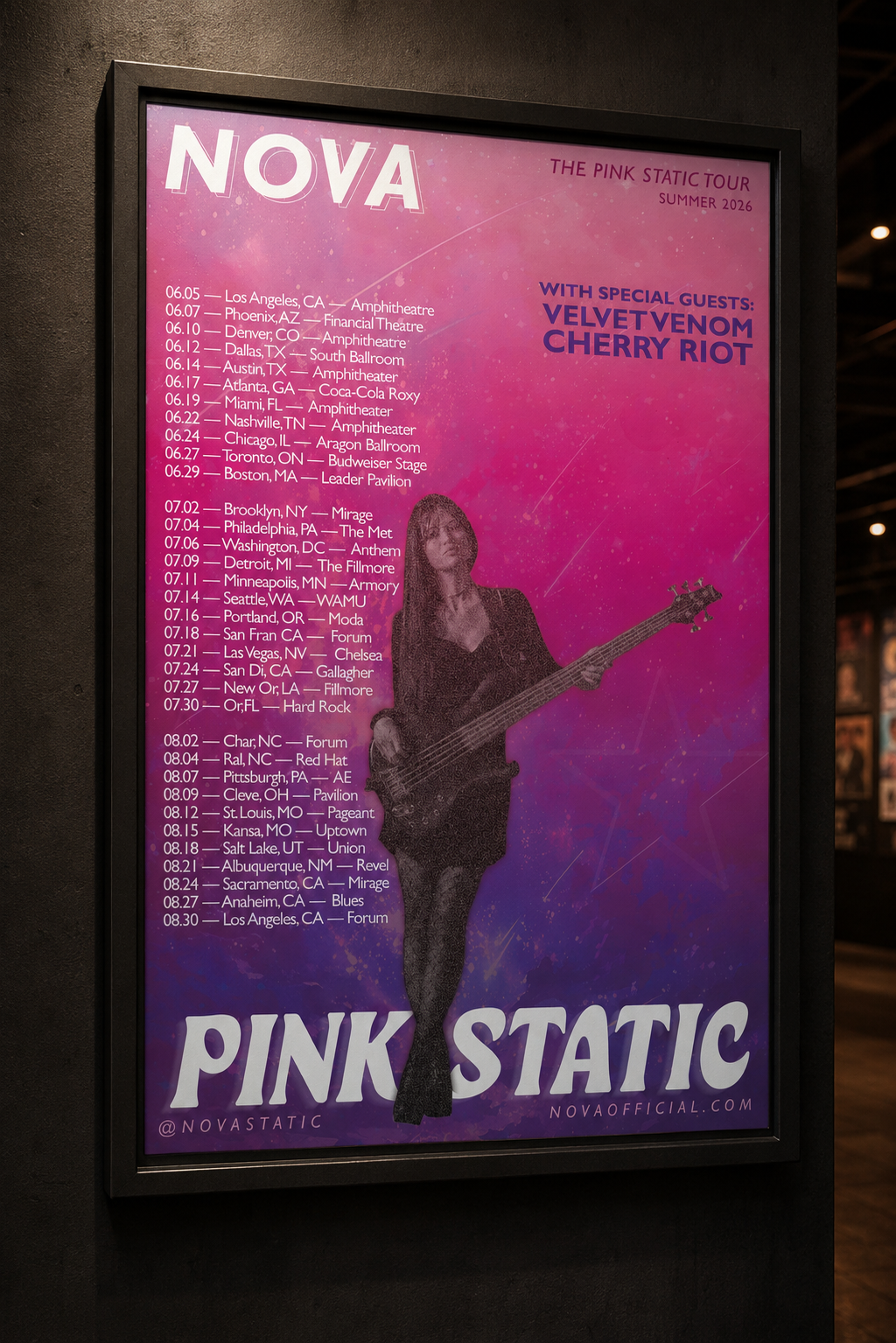
mockup
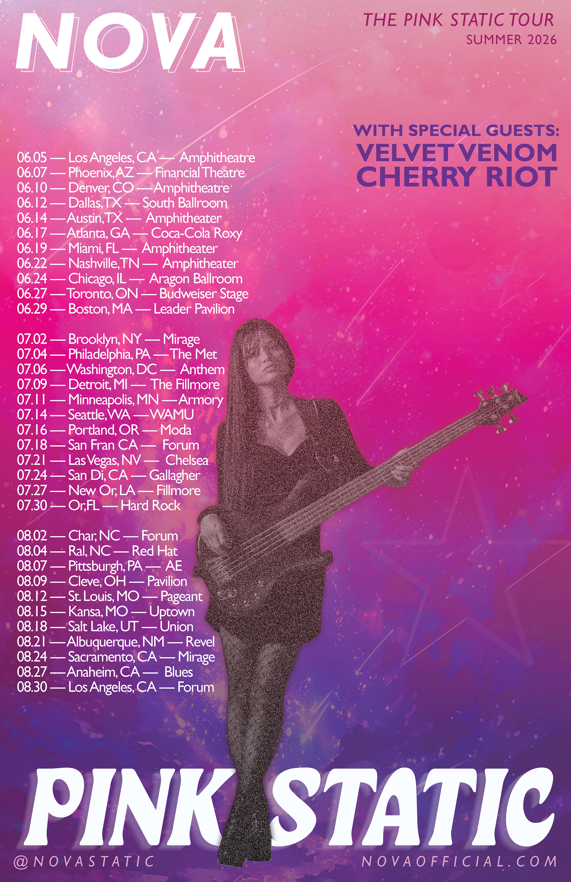
For this project, I developed a complete visual identity for a fictional punk rock guitarist, designing both a tour poster and album artwork that worked together as a cohesive system. I wanted to challenge genre expectations by creating a musician who exists within a typically dark, black-and-metal aesthetic space, but instead embraces bold femininity through pink, stars, and cosmic imagery. I named the artist Nova to reflect her explosive energy, individuality, and sense of power, and built her album and tour around the concept Pink Static and the “Pink Static Tour,” ensuring every design decision supported a unified brand identity.
For the visuals, I began with a galaxy background and layered pink tones, glitter textures, and subtle color shifts to create a dreamy but high-energy space environment. I added star elements throughout the composition to reinforce the celestial theme while maintaining balance and visual hierarchy. A photograph of a female guitarist served as the focal point, which I edited into black and white with a slight magenta tint and layered grain to connect it to the “static” concept. I also explored negative space and layering by positioning her in front of the album title, while surrounding her with tour dates and locations that frame the composition. Overall, the goal was to create a poster that felt like a collectible art piece; something fans would not only recognize as promotional material but also want to display as part of Nova’s visual world.
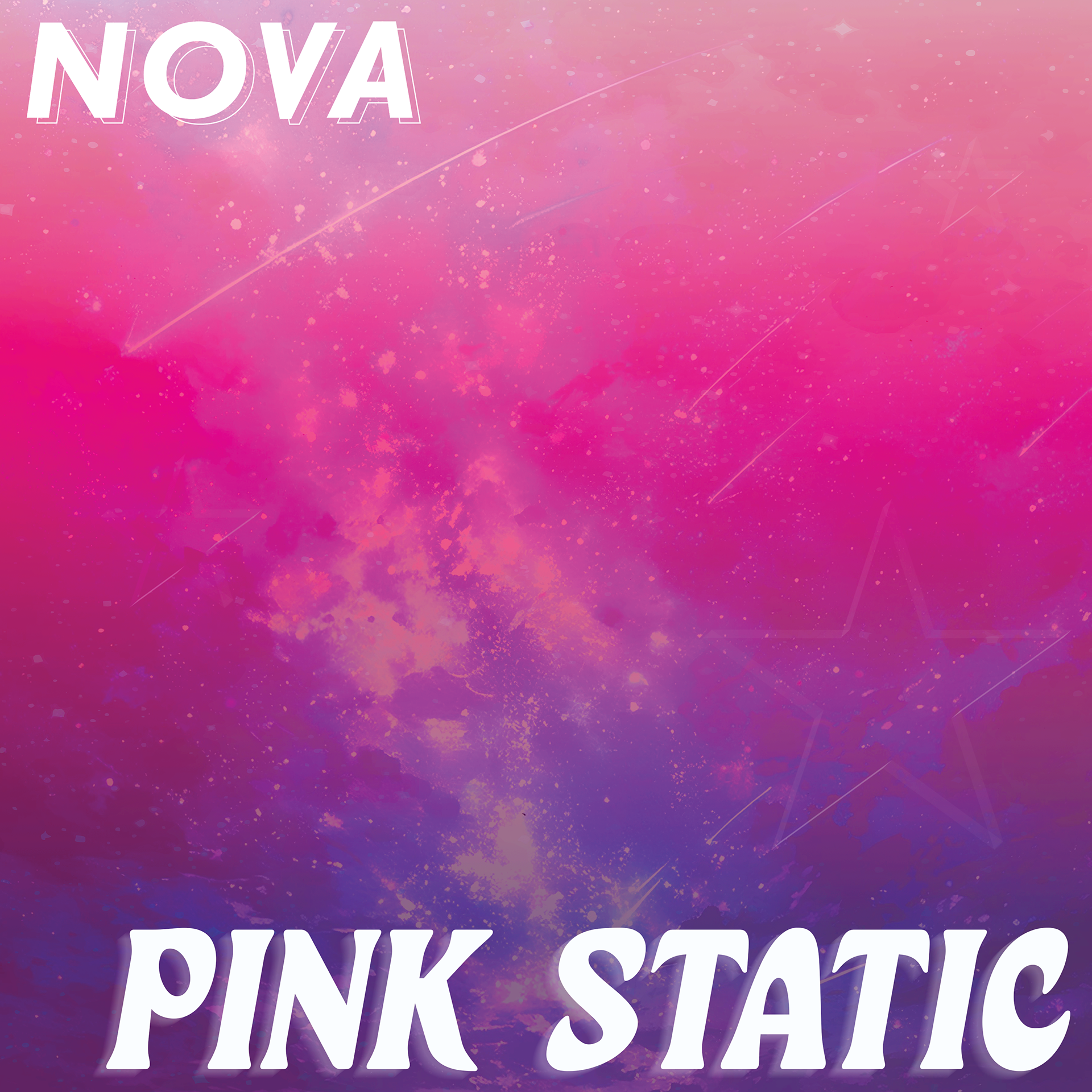
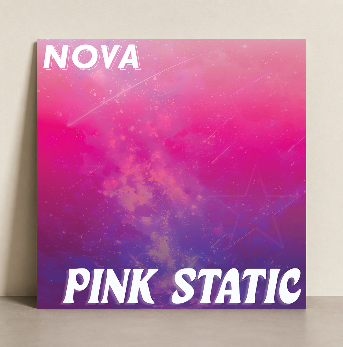
For the front cover of the album, I extended the visual language established in the tour poster by using its galaxy background as the primary foundation for the composition. The focus was placed on typography and atmosphere, allowing the scene itself to carry much of the visual weight. I selected typefaces that aligned with the bold, cosmic aesthetic of the project, pairing a dynamic, expressive font for the artist's name, Nova, with a more distinctive, stylized type for Pink Static to reinforce the playful, star-driven identity. To enhance cohesion, I applied an outlined drop shadow to “Nova” that echoed the surrounding star shapes, while using a softer, faded shadow effect on “Pink Static” to suggest movement and gradual dissipation into the background. Overall, the goal was to create a sense of motion and energy while keeping the composition clean and typographically driven.
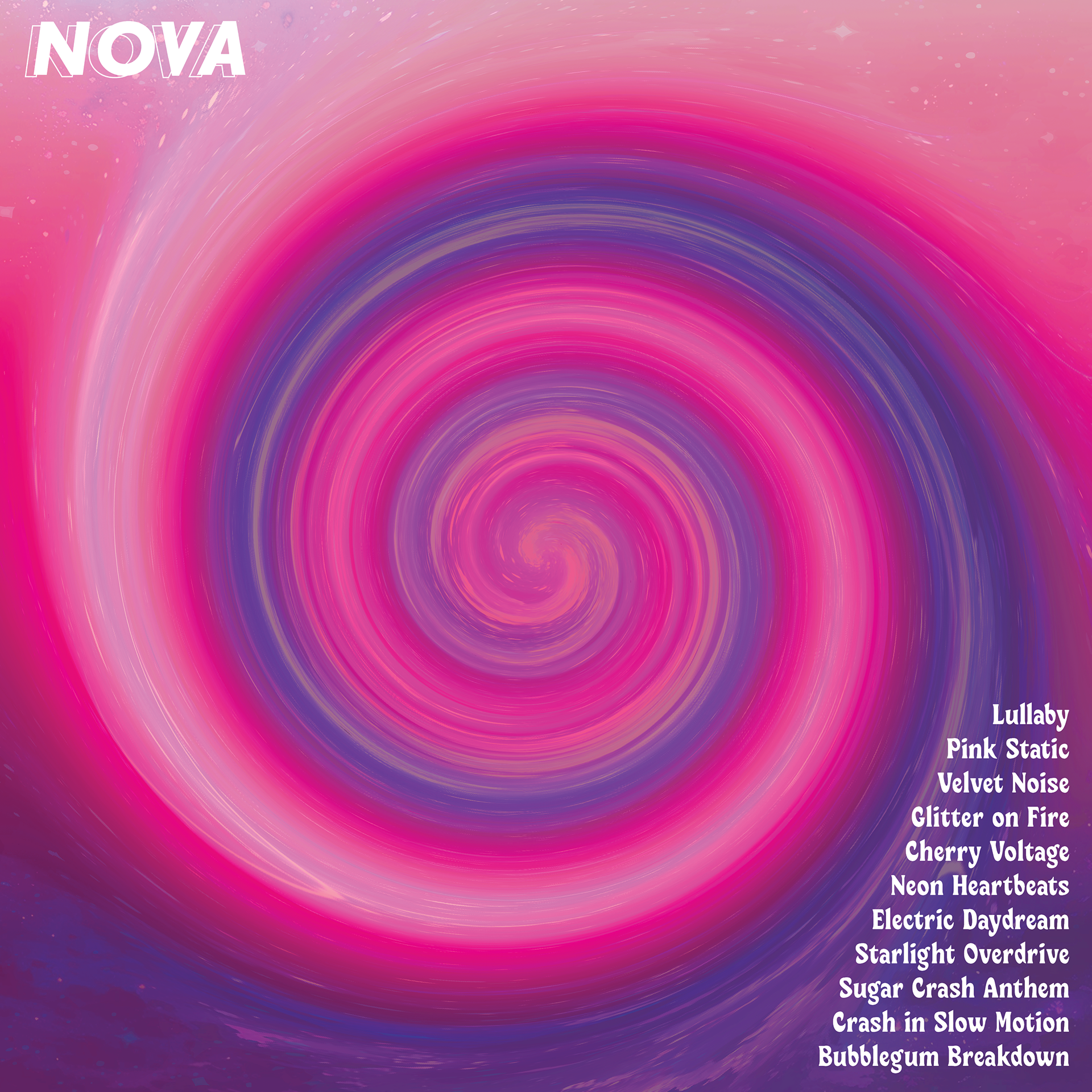
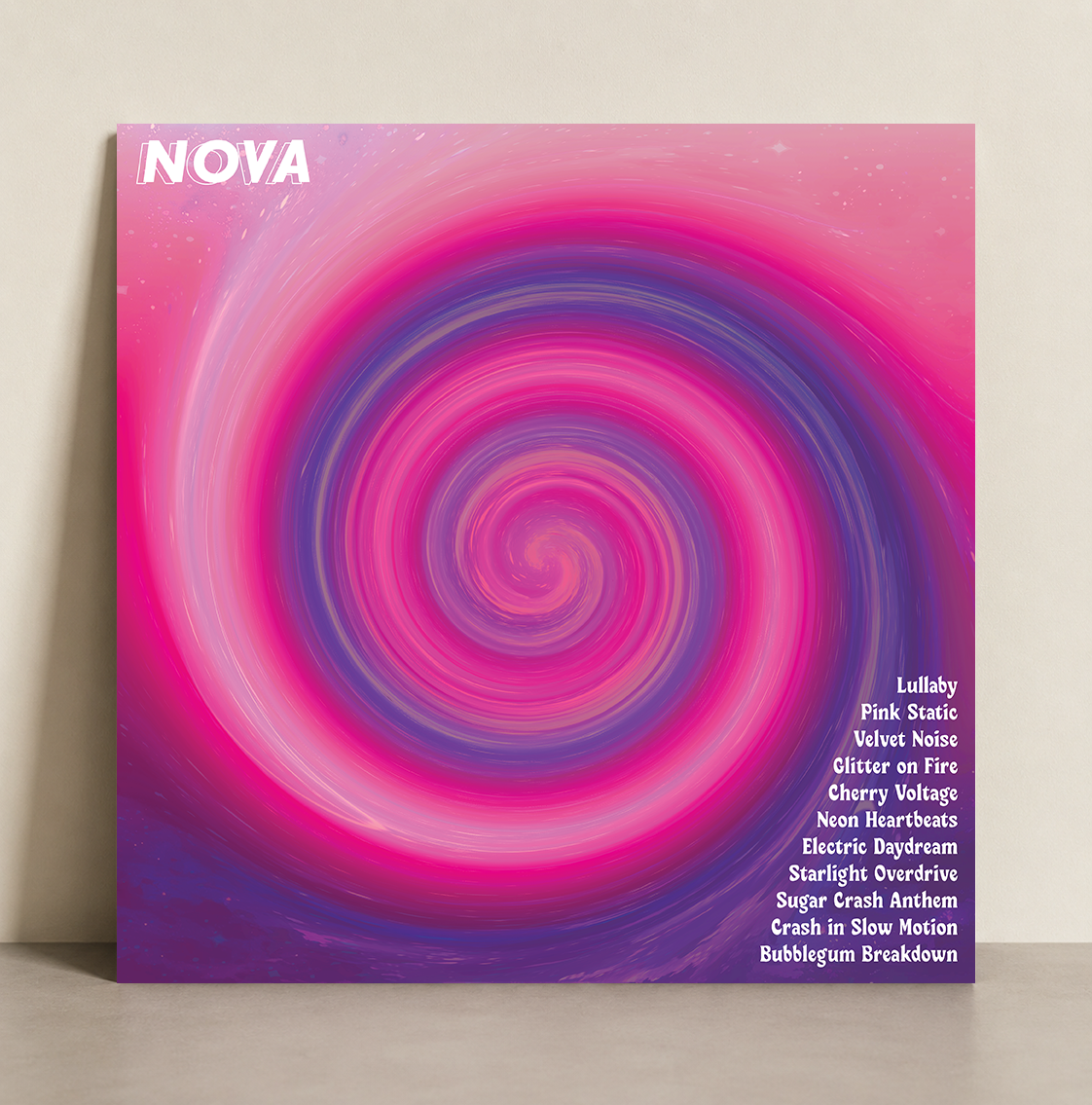
For the back cover, I shifted toward a more immersive and hypnotic concept centered around a spiral motif inspired by the idea of a black hole. I wanted the viewer to feel drawn into the composition, as if being pulled into the visual world of Pink Static. To achieve this, I repurposed elements from the original poster and front cover backgrounds, then manipulated and rotated them into a swirling formation with enhanced color grading to create a seamless, continuous palette. The typography and supporting elements were kept minimal so the spiral remained the dominant focal point, with subtle outlined text integrated into the movement of the design. This approach created a cohesive connection between both sides of the album while reinforcing themes of space, energy, and motion throughout the project.