I developed Origin, a conceptual magazine brand centered around immersive visual storytelling and strong editorial identity. I created The Salt Issue, designing the cover, table of contents, and a series of editorial spreads that explored a range of layouts and stylistic approaches while maintaining a cohesive overall aesthetic. Through careful attention to typography, composition, imagery, and color palette, I focused on creating a publication that felt unified across every page while still allowing each spread to have its own distinct visual voice. I used Photoshop for all designs in this project.
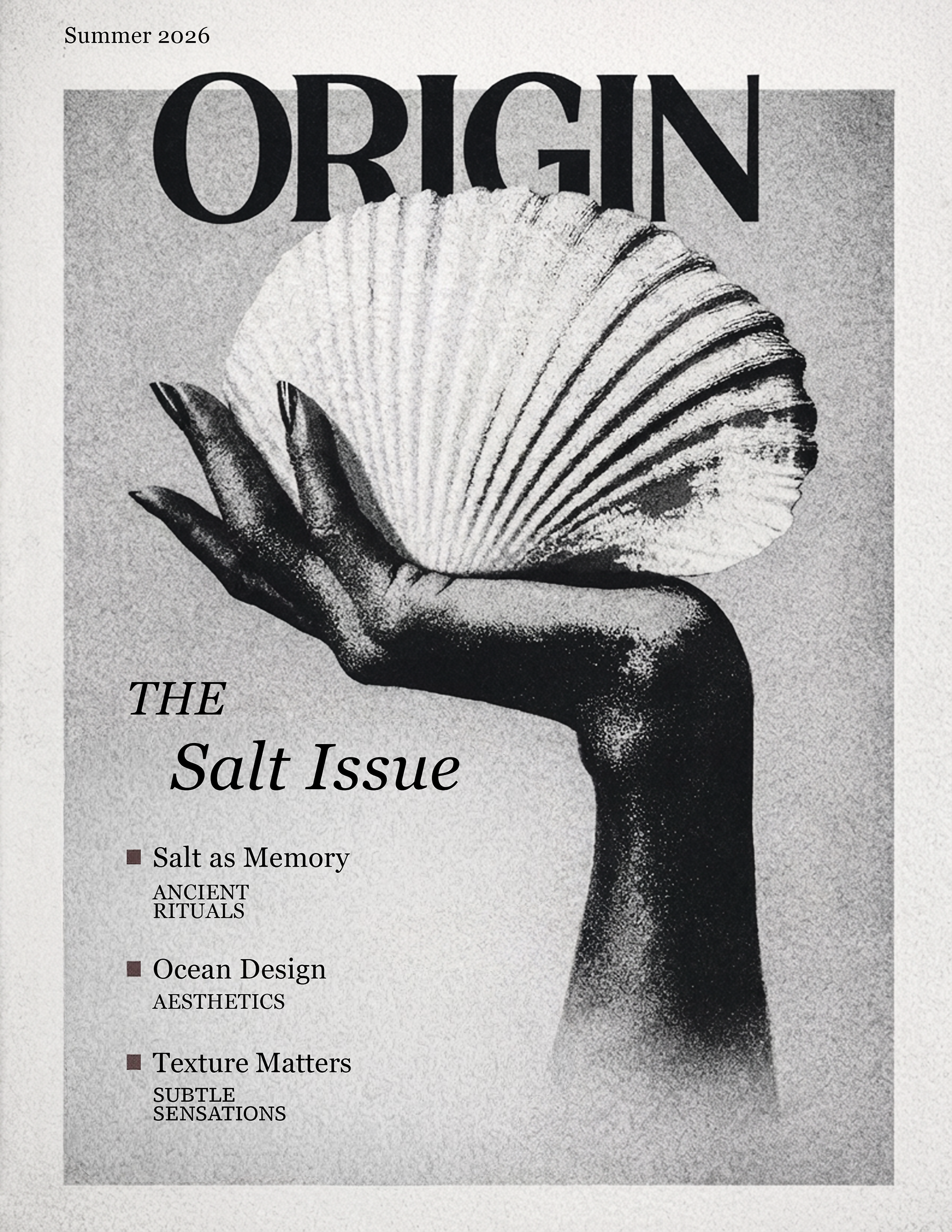
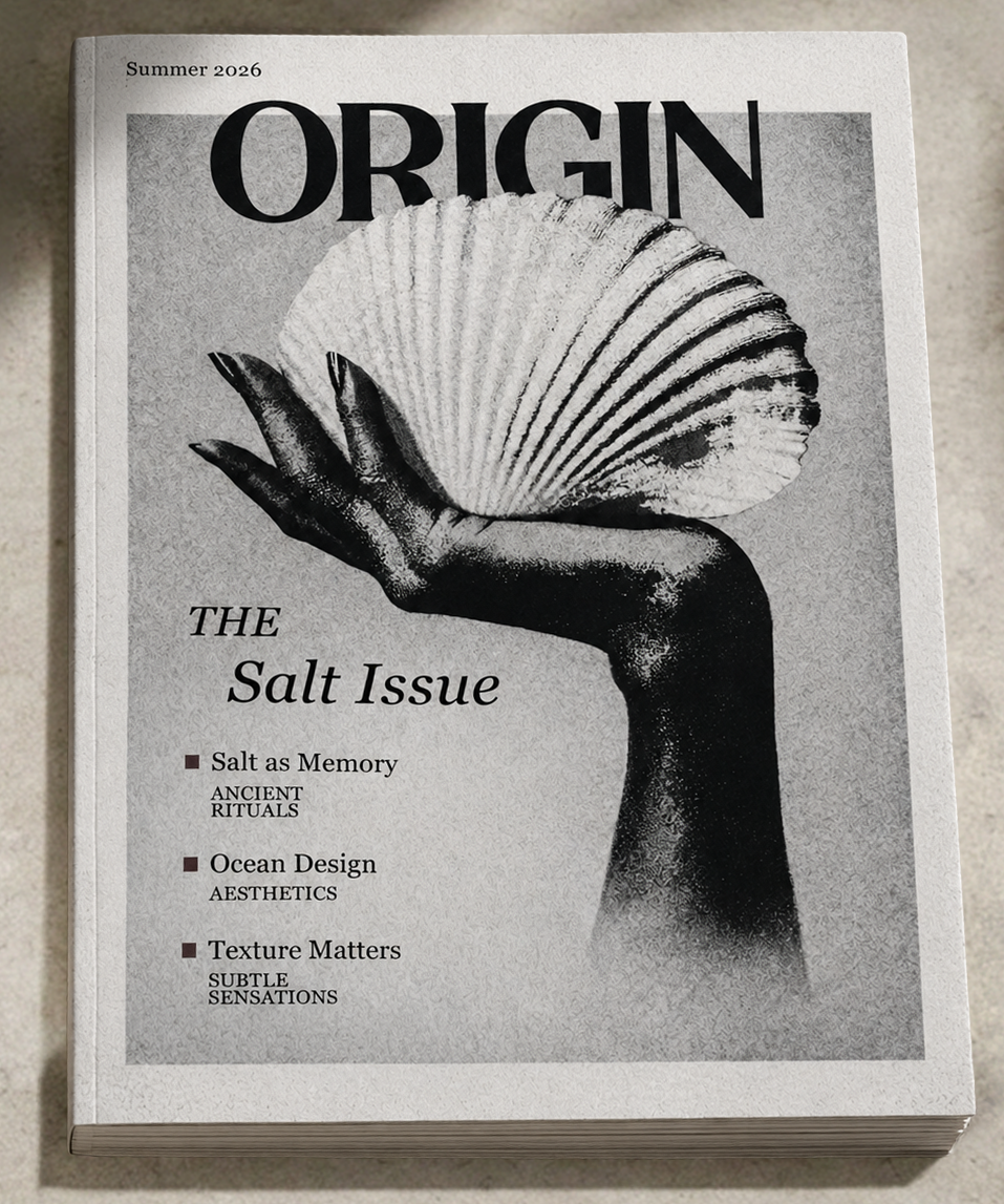
Beginning with a single image, I manipulated the composition through layered coloring, grain, and texture treatments to create a sandy, dissolving effect that allowed the subject to blend seamlessly into the background. High contrast was central to the design, helping the monochromatic palette feel rich and dimensional while reinforcing the stark, black-and-white identity associated with the word Origin. Inspired by editorial publications such as Vogue, Time, and National Geographic, I incorporated a clean white border, elegant typography, and layered text placement to achieve a refined editorial aesthetic. Separating the figure from the background allowed me to create a layered effect, adding depth.
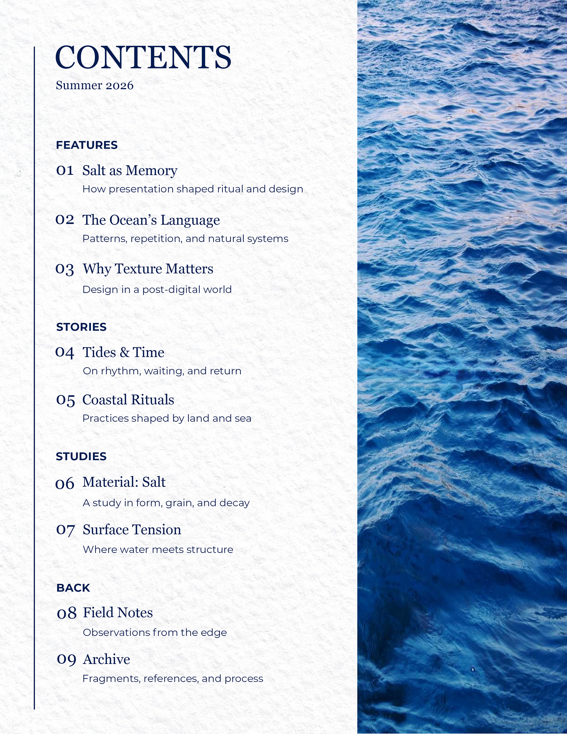
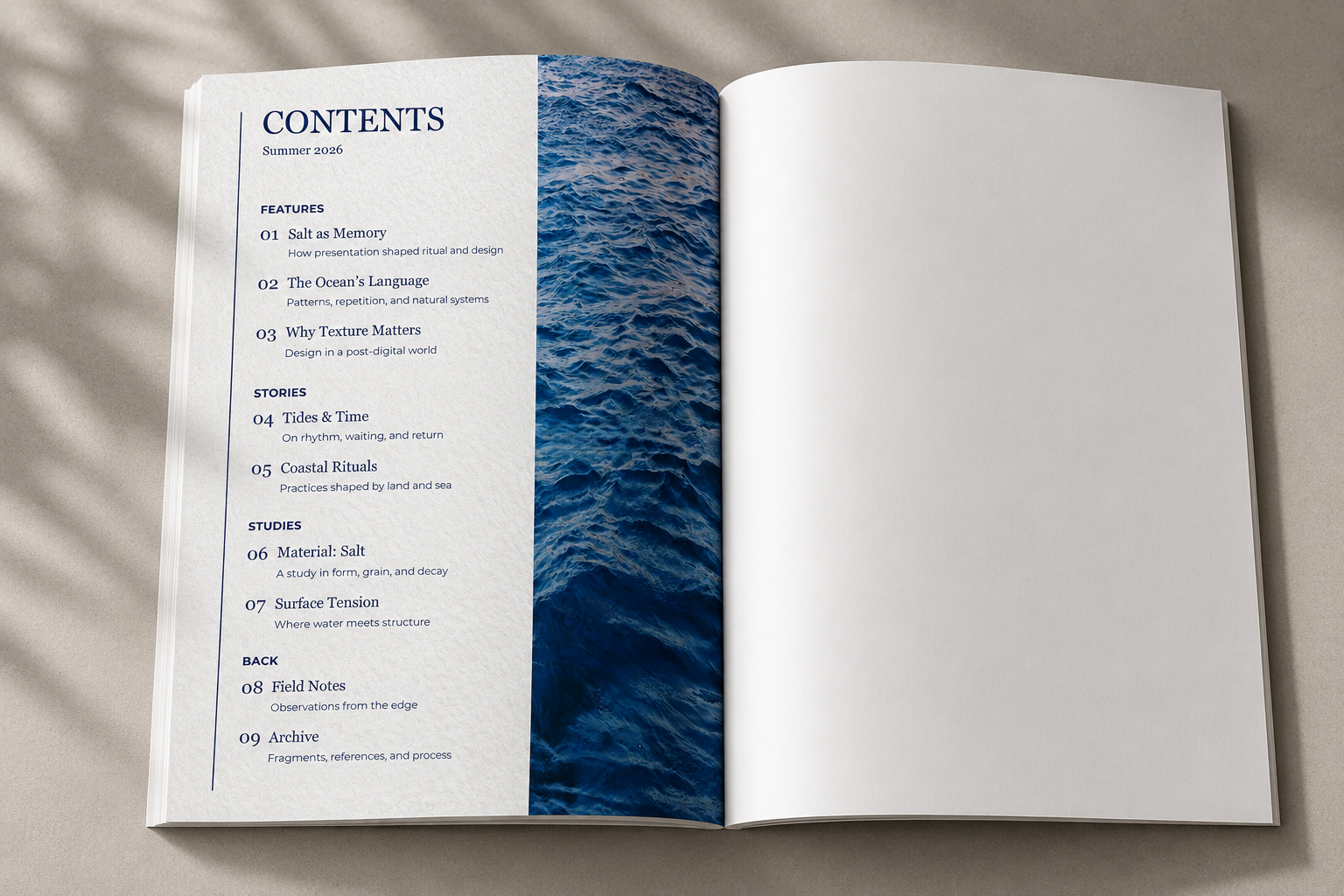
For the table of contents, I focused on simplicity and atmosphere to complement the overall identity of Origin: The Salt Issue. Using a close-up photograph of ocean water, I emphasized texture and movement to create a sense of depth and fluidity across the spread. I further refined the image through color adjustments and tonal editing, allowing the palette to remain cohesive with the rest of the magazine’s muted, high-contrast aesthetic. To enhance the tactile quality of the design, I incorporated a subtle paper texture that gave the spread a more organic and editorial feel while maintaining a clean, minimal layout.
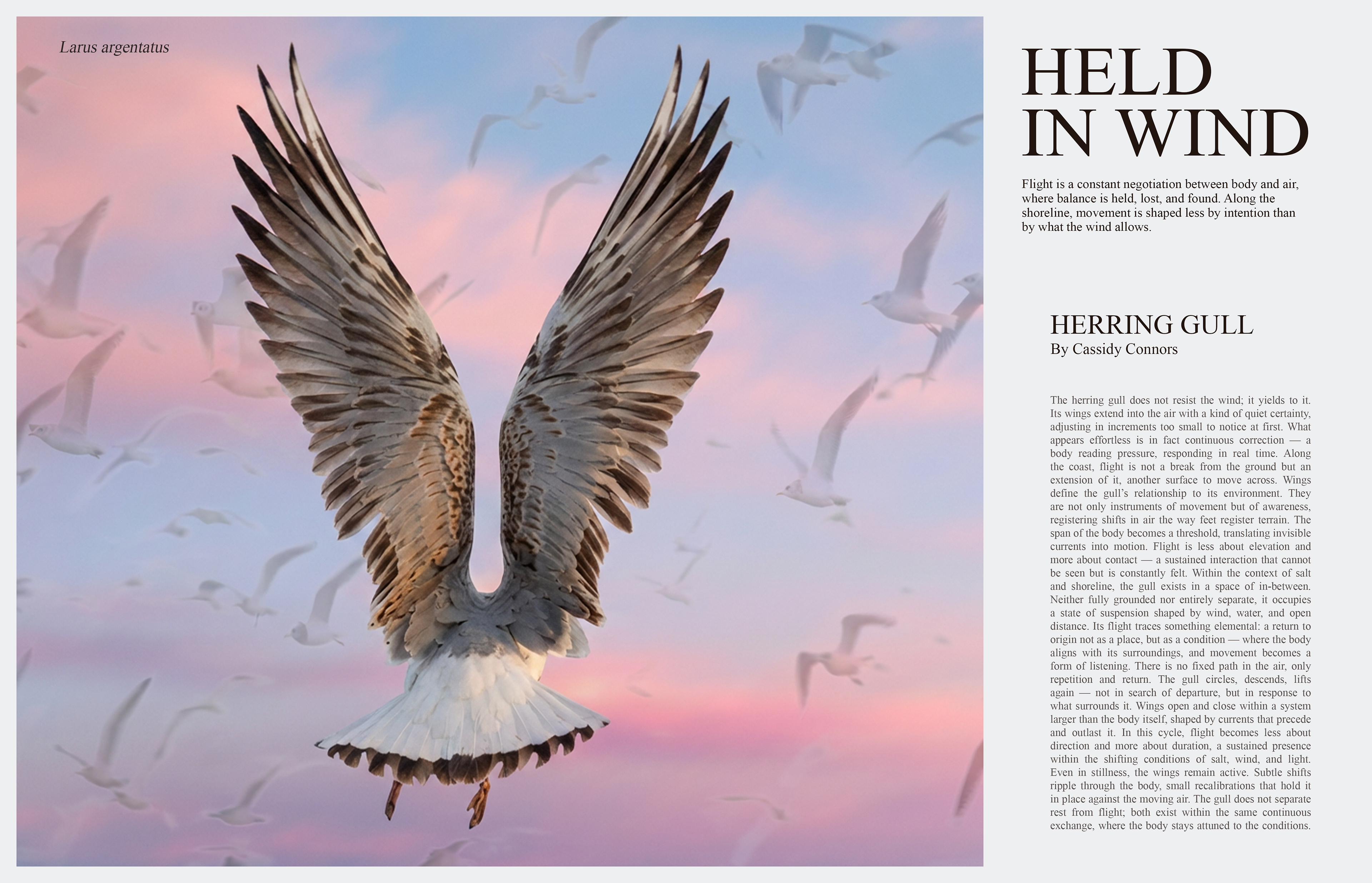
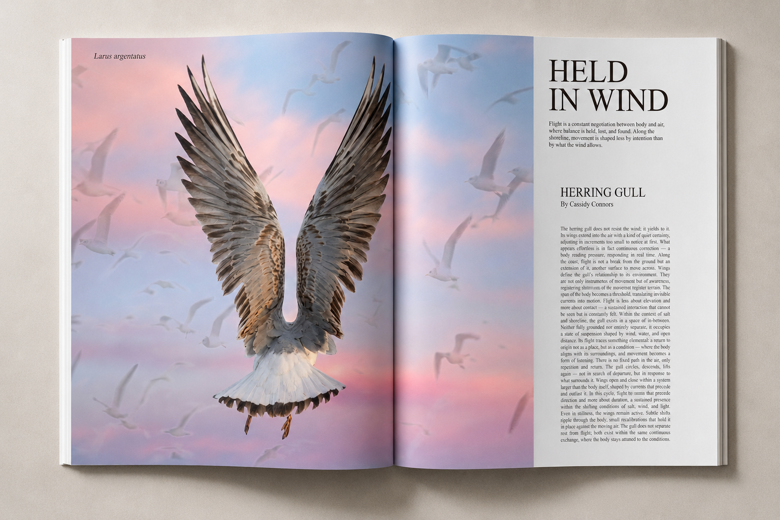
I wanted to create a composition inspired by the structure of a classic magazine layout while still maintaining the atmospheric identity of Origin: The Salt Issue. I began with a photograph of a seagull, enhancing both the image quality and tonal range to create a stronger visual focus. To build the environment around it, I incorporated a soft pink sky alongside a secondary image of a flock of seagulls placed subtly in the background with lowered transparency. This layering technique added movement and depth without distracting from the main subject. Throughout the spread, I carefully harmonized the lighting, tones, and color palette to ensure the imagery felt cohesive, balanced, and visually immersive.
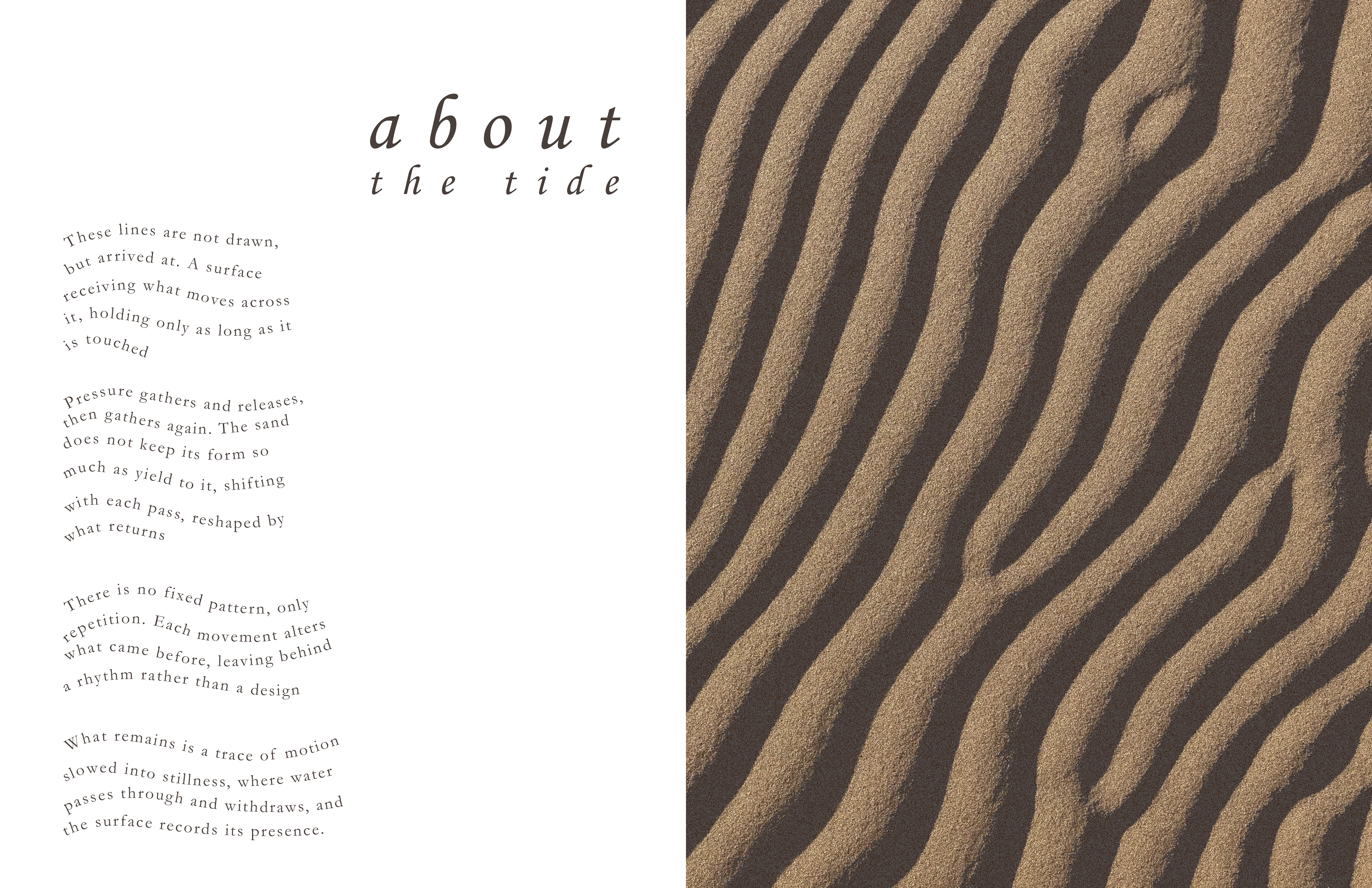
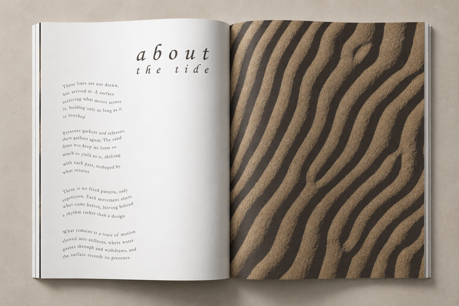
For the second spread, I moved away from a traditional editorial structure and approached the design from a more poetic and expressive perspective. Inspired by my interest in poetry, I created a spread centered around the movement and rhythm of the tide. Beginning with a photograph of lines formed in the sand by ocean water, I edited the tones and layered multiple textures to create a tactile, grain-like surface that felt realistic and immersive. I selectively removed portions of the image to incorporate digital paint, allowing the composition to feel subtly manipulated; familiar at first glance, yet slightly surreal in a way that is difficult to immediately identify. To reinforce the theme of tidal motion, I wrote an original poem and arranged the text along loose, flowing curves that mimic the movement of water across the shore.
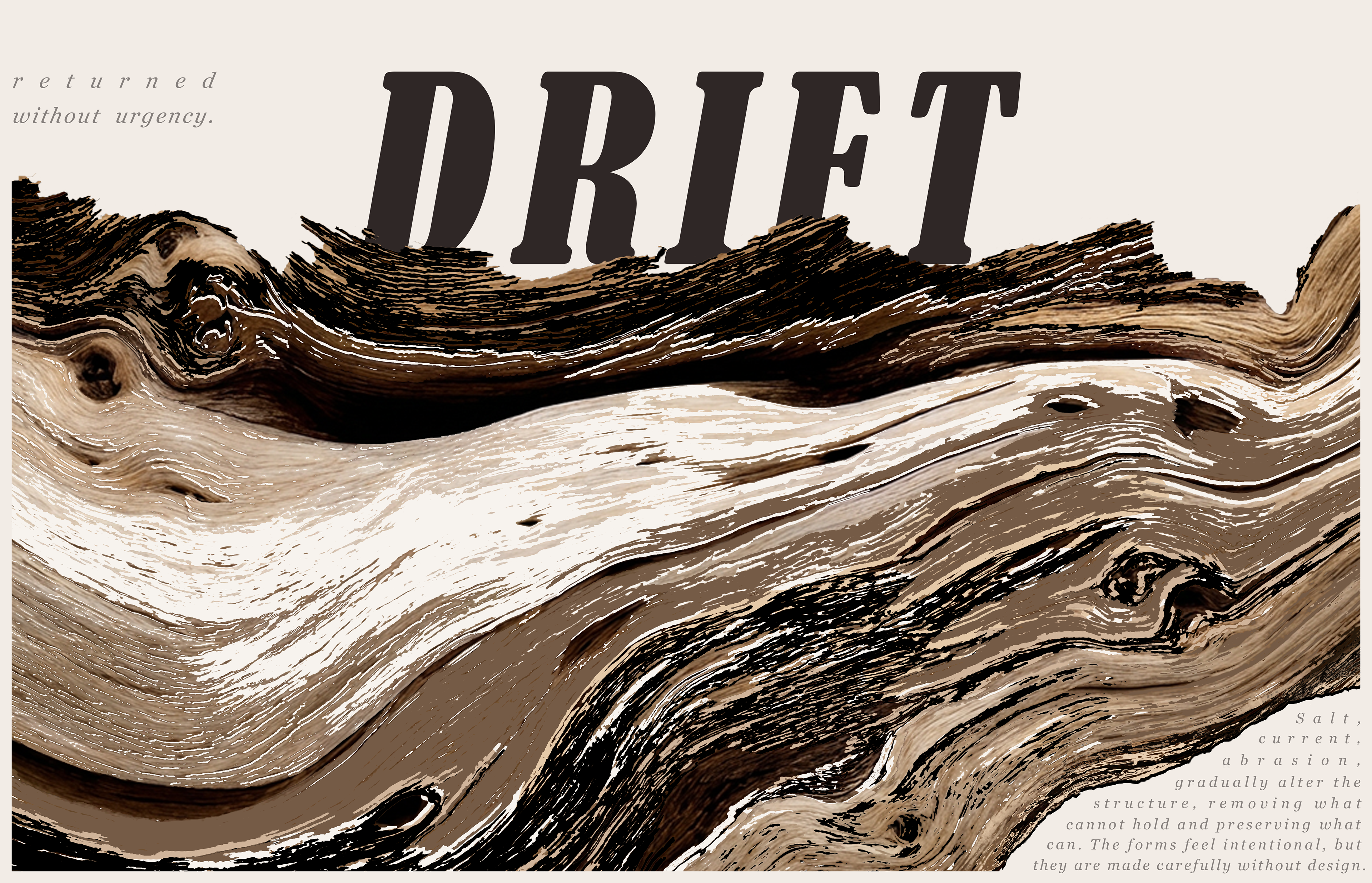
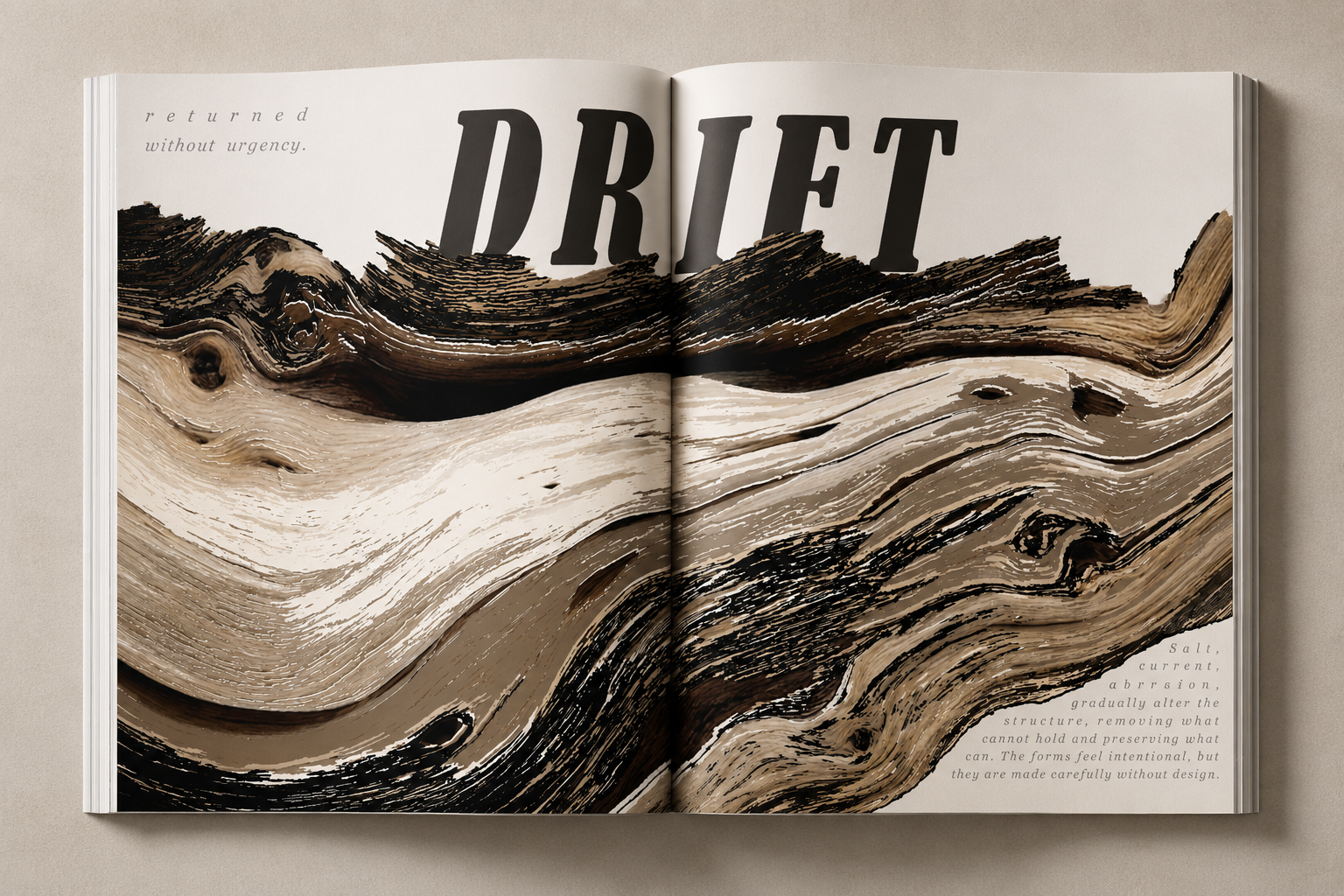
For the final editorial spread, I wanted to create a large-scale visual piece that felt expressive, textured, and immersive. Using a photograph of driftwood as the foundation, I manipulated the colors and layered textures to enhance its natural forms and weathered appearance. I selectively removed sections of the image and integrated digital paint to create sharper, more stylized edges that contrasted with the organic movement of the composition. Typography played a major role in the spread, with a bold headline paired with a typeface that felt raw, natural, and fluid, echoing the texture and motion of the driftwood itself.
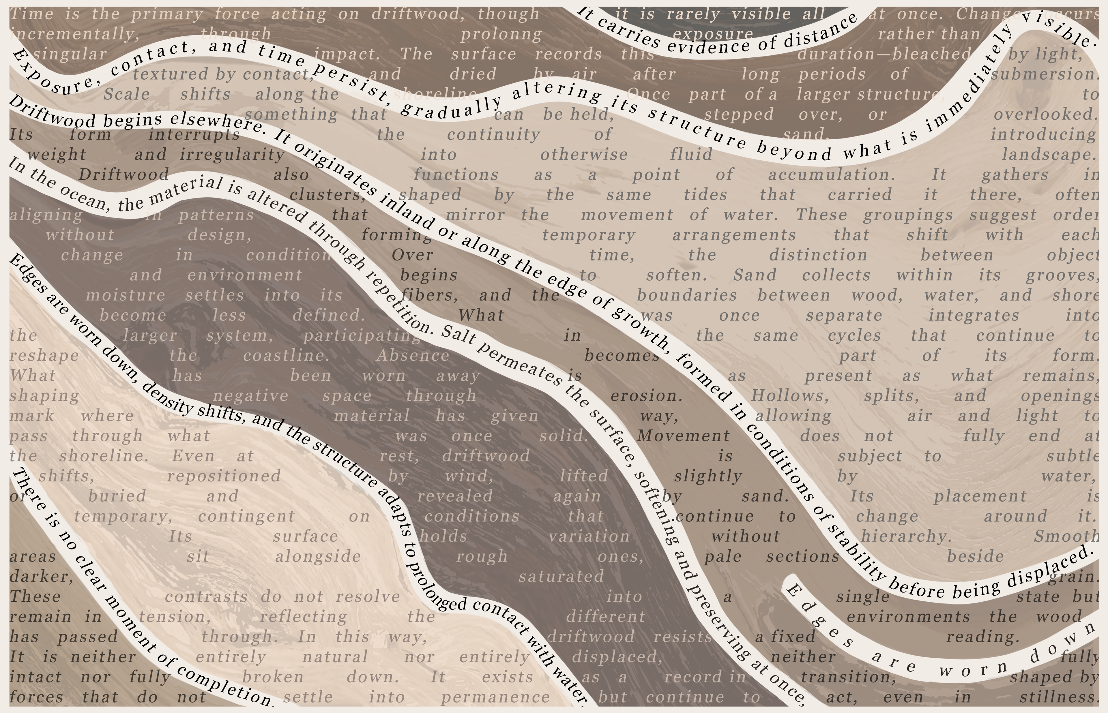
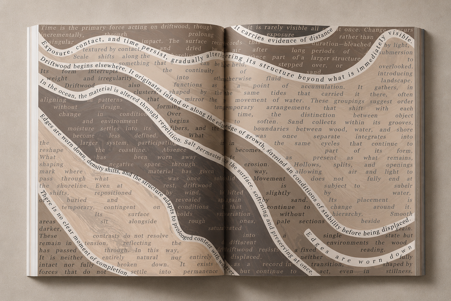
To connect the piece to the previous spread, I incorporated subtle text elements that guided the viewer into a largely typographic page dedicated to the accompanying story. Through repeated shapes, directional movement, and a consistent color palette, both spreads work together as a cohesive editorial sequence.